Tagged: wedding photography

Published – The Knot Magazine – Holly & Brian

It’s really rough spending Christmas in Florida with family. Of course, I’m saying this with a pound of sarcasm. It was weird being in the warm Pensacola climate at Christmas time, but we survived just fine. The 15-hour drive home seemed to take forever, but I was greeted with some amazing news when we arrived.

As I always do, I promptly fetched the mail from our mailbox. Stuffed inside was about 25 pounds of late holiday cards, Christmas catalogs, and other detritus. However, hiding among the treasured cards and other trash was a curious little package. In a Christmas habit, I gave the package a squeeze and a shake. Then it hit me! I tore into the package and was greeted by long awaited, but temporarily forgotten news. The new Knot Magazine had arrived.

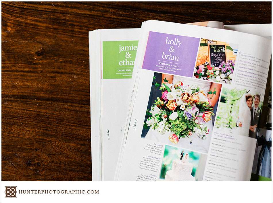
I am pleased as punch to announce that a Hunter Photographic wedding has been featured in The Knot Magazine for the second time in a row. For the Spring /Summer 2012 issue, the editors of the Knot reached out to me and requested a fresh wedding right off my site. They chose Holly and Brian’s amazing wedding at Lantern Court and Holden Arboretum in Kirtland, Ohio. I was not surprised at all when the Knot requested the wedding. Holly and Brian’s wedding is definitely one of my favorites from this year. It was so special in so many ways.

I was just there to capture the moment. Holly and Brian deserve all the credit for planning such a unique wedding. Also, special thanks to Carri-An at Holden Arboretum for presenting such an amazing venue and for being a gracious help. Also, kudos to JMS Originals for putting together such amazing flowers. The flowers were truly unique. Lastly, Cakes by Maria & Joe put together a fabulous cake. I hear it was very tasty!

As I noted above, this is the second Knot Magazine feature in a row for us. Jamie and Ethan’s wedding was featured in the last issue. Looking forward, I will have a lot of good news to share over the next few weeks. More publications, blog posts, and new ideas are coming soon. To say the least, 2012 is going to be a truly special year. I hope everyone has a bright and beautiful 2012!


Initial Impressions – VSCO Film from Visual Supply Co.

[UPDATE – I have published a detailed video review of VSCO here]

If you have been around here long enough, you know that I shoot a mixture of digital, film and polaroid. I love each for the qualities and capabilities that they bring to my visual voice. Film brings amazing colors, depth and range. Digital brings versatility, speed, and accuracy. Visually speaking, I have always favored film. When I shoot digitally, I do so in a way that instills some qualities of film in the digital photographs. Do I think you can manipulate digital enough to completely replicate the look of film? Of course not. I would not have three medium format film cameras otherwise.

Now enter the new software package from Visual Supply Company – VSCO Film. Photographers on Twitter were abuzz yesterday as VSCO released their new software, and unleashed a mighty marketing blitz. Frankly, I missed the boat yesterday. I didn’t see anything about the new software until this morning. However, over my morning cup of coffee, I became quickly impressed with what I was reading and seeing. Visual Supply’s approach to is completely new and different.

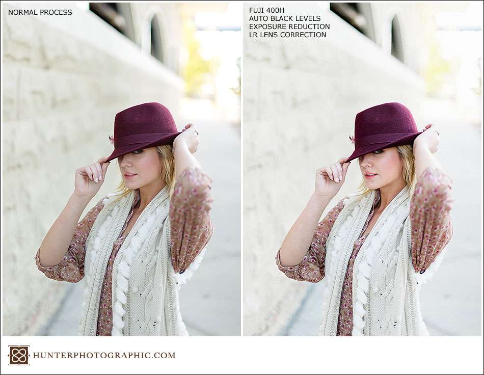
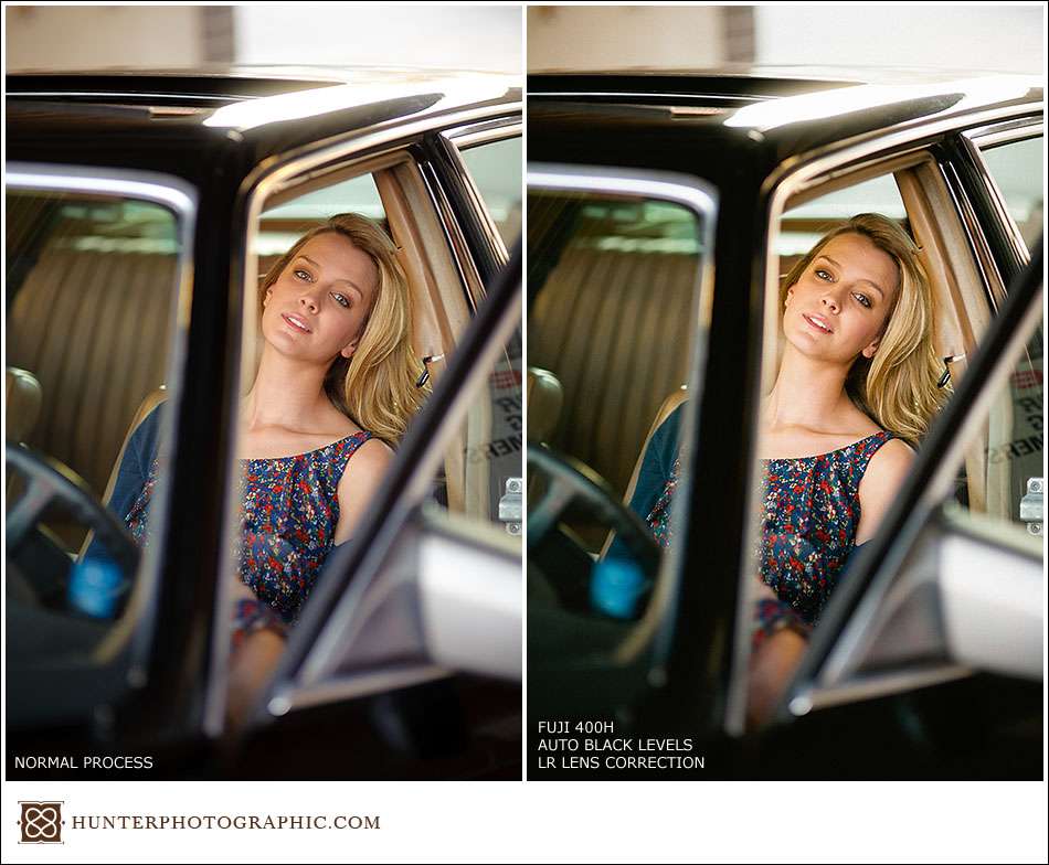
Not long ago I shot a high school senior session in Cleveland with Elise, and I will be using these images for some comparisons. Below are samples from the session, first processed as I normally do in Lightroom, and then reprocessed in Lightroom using VSCO. I’ll include my initial impressions as we go –
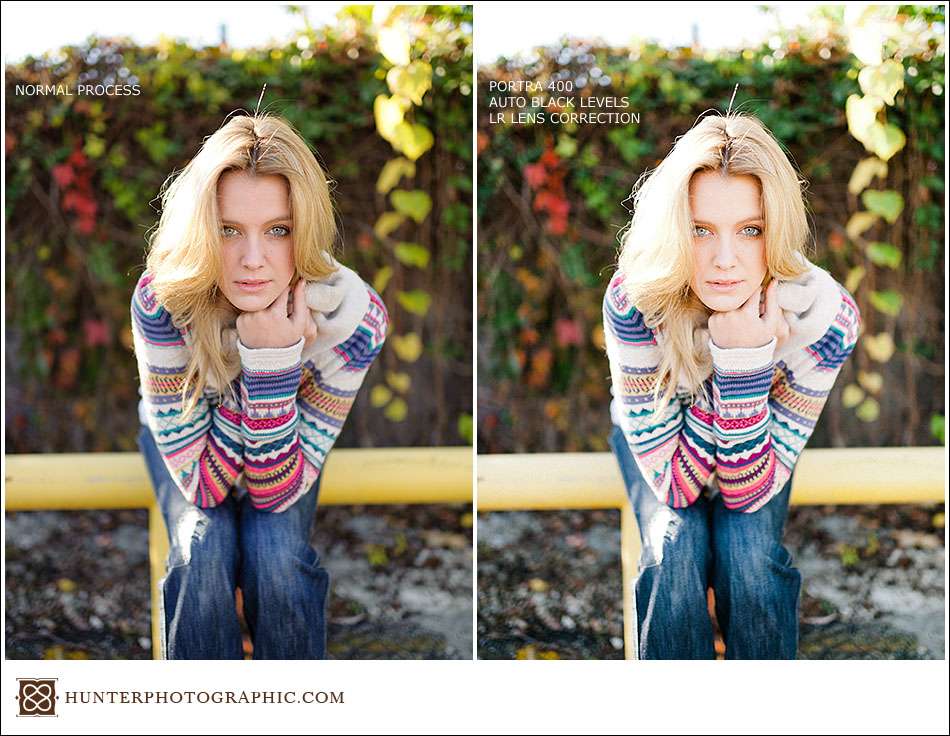
VSCO film sample images with before and after from Hunter Photographic

As I noted above, when I shoot digitally I do so in a way that can replicate some facets of film. In the samples above and below, you can see how this can cause problems when re-processed with VSCO Film. The image on the right is a bit too washed out, especially in the skin tones. However, the overall image is closer to the core of my visual voice. There are definitely some aspects here that I love. In short – VSCO will likely require properly exposed images and would not work well on anything over-exposed.
VSCO film sample images with before and after from Hunter Photographic

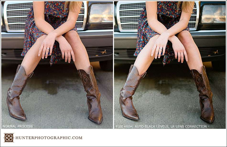
Below is a much more normal exposure. With VSCO Film applied, the results really shine. The skin tones are boosted and some of the colors really come out. It is more contrasty, but I like it. The pink skin color is reduced while the yellows come alive. With VSCO, you can also see a distinct green tone to the concrete.
VSCO film sample images with before and after from Hunter Photographic

VSCO film sample images with before and after from Hunter Photographic

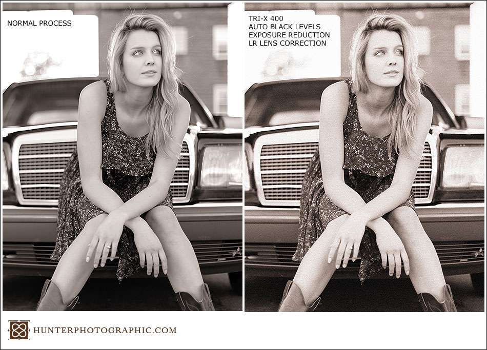
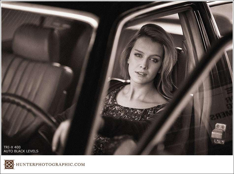
Above is an example of one B&W option – Tri-X 400. It looks good, but it is not as impressive as some of the color “film” options. I did have to pull the exposure back down a bit due to the source image being a little hot. The standard grain on Tri-X 400 is a bit much for me. However, VSCO Film does include a preset to turn grain down, or off. Also, I believe the brown tone is actually from my personal preset and it didn’t get removed, or VSCO uses more brown than I do.
VSCO film sample images with before and after from Hunter Photographic

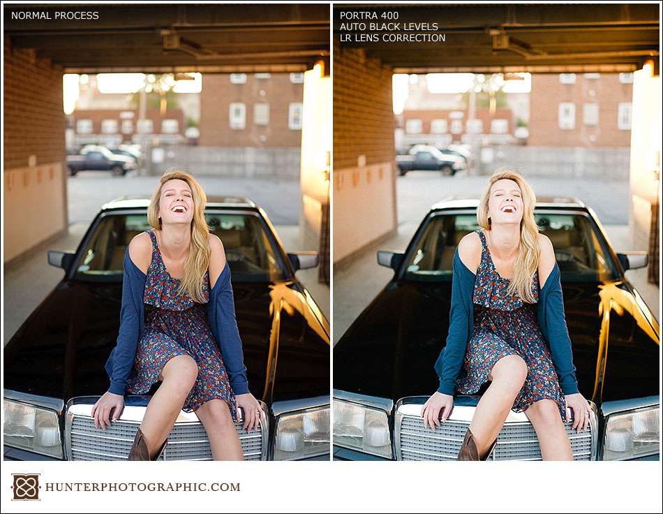
The sample below completely sold me on VSCO Film. I love the the new outcome on the right. The colors are a complete home run for me. Again, this image is much more of a normal exposure, which explains why the highlights are kept under control.
VSCO film sample images with before and after from Hunter Photographic

VSCO film sample images with before and after from Hunter Photographic

No before and after on the last frame. I simply love how this looks with the VSCO Film Tri-X preset.

I think VSCO Film is able to find success with this preset package because of how they accomplished their goal. Instead of just creating a standard Lightroom preset that changes the normal settings, VSCO created custom camera profiles. VSCO Film does get closer to the “film” look, but of course there are some limitations. If I want the film look, then I will continue to shoot film. However, VSCO allows me to better align my digital photographs with my core visual voice. I have always believed in pure images and have never purchased a preset package before – evar! I choose to present a very clean, natural and organic vision. Even though VSCO Film is a group of presets, it definitely has a home in my workflow. Like my vision, Visual Supply strives towards very natural imagery, and accomplishes it very well.

It is certainly not a one-click solution, no matter what Jonas says, this will not significantly speed up your workflow. For example, VSCO does nothing with white balance. Nor will VSCO turn you into an amazing photographer. You still need a subject. You still need good framing. You must get it right in the camera. VSCO Film can only help you take a great exposure and move it closer to your visual voice.

Your clients will not care if you use digital, VSCO, or film. They care about your vision and their photographs, among many other things. Seek to create your own personal style. If VSCO can help with that, then more power to you.

P.S. – These are just my initial impressions. Over the coming months, I will continue to use VSCO as I feel needed. Stop back often to see if you can spot when I am using straight digital, digital and VSCO film, or just plain old film.

Katie & Mischa – Victorian Wedding in Chautauqua, New York

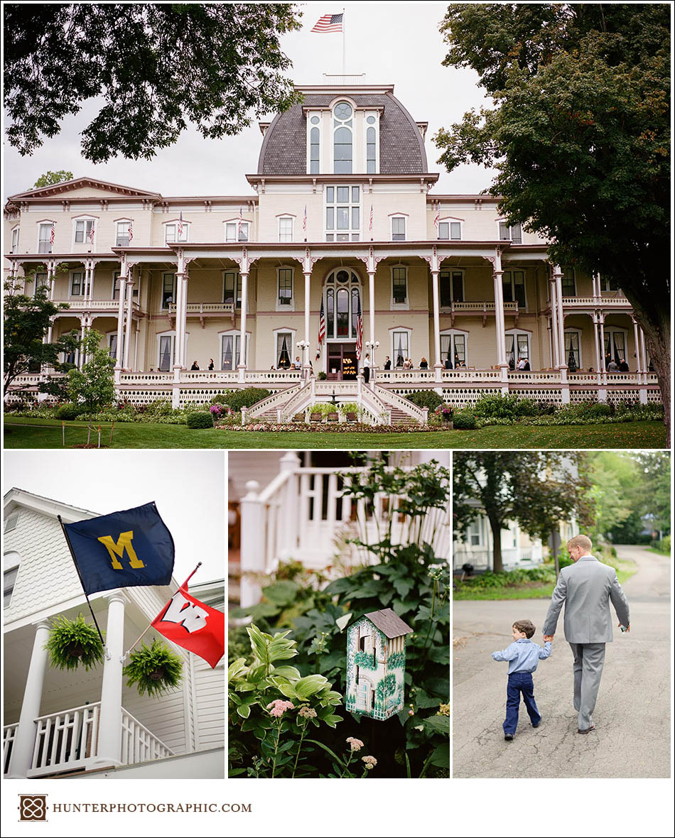
“That’s where you are getting married” I said with a slack jaw, while staring in awe at the Hall of Philosophy. Katie was giving me a tour of the Chautauqua Institution, a gated lakeside community famous for it’s summer programming and dedication to education. I arrived early on Friday to take a little tour and do some location scouting. Because I was there early, I also volunteered to photograph their wedding rehearsal.

Katie grew up spending her summers at the Chautauqua Institution with her family. She has many fond memories of the area, so she decided to host the wedding around the Chautauqua area. It’s important to use pieces from your life to design your wedding. The wedding will take on an amazing personal feel, something everyone seeks to accomplish. Because Katie and Mischa had planned such a personal wedding, everyone had an amazing time the entire weekend. Chautauqua is a Victorian-style community, so the wedding was designed to echo the local design. Not just another “vintage wedding”, Katie’s design drew heavily on her actual memories of the area.

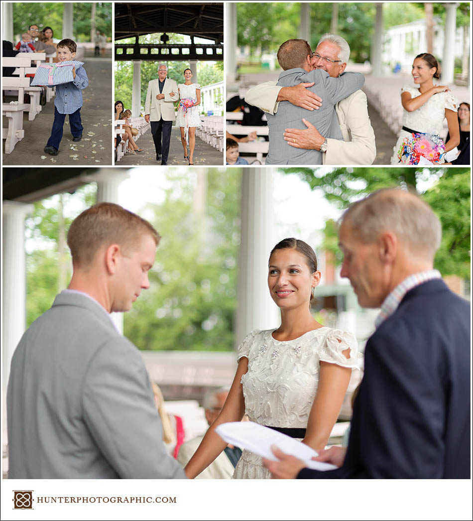
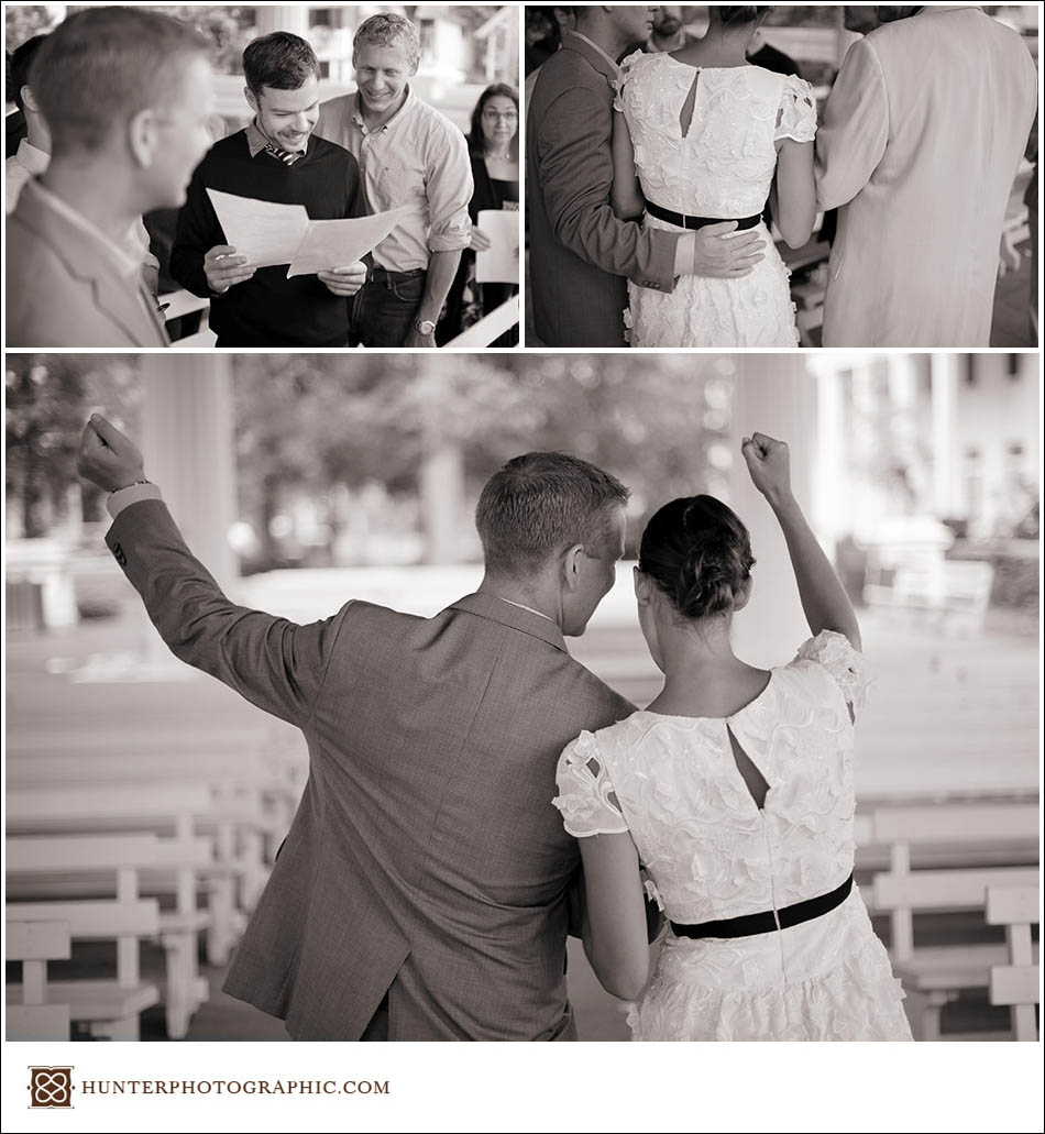
Katie and Mischa’s personal touch spread beyond the wedding design. You could see it manifested in their love for each other, love for their friends and for family. Their friends gave amazing, personal readings during the ceremony. The Maid of Honor gave the most heartfelt toast and had everyone in tears. The love that surrounded the entire wedding party made capturing their wedding photos easy – all I needed to do was stand back and not get in the way. The effort they put into the wedding and the love that surrounded the day really comes out in the photographs. I hope you enjoy the highlights below as much as Katie, Mischa and I did.

Katie and Mischa's victorian-inspired wedding in Chautauqua, New York

Katie and Mischa's victorian-inspired wedding in Chautauqua, New York

The wedding rehearsal could not have been more fun. People were rushing to hug old friends they had not seen in years. Even the ring bearer got a standing ovation when he successfully made it down the aisle without getting distracted.

Katie and Mischa's victorian-inspired wedding in Chautauqua, New York
The rehearsal dinner was held on the Chautauqua Belle, an old paddle ship that cruised along Lake Chautauqua during sunset. The scenery was just amazing. However, I think the food was better. Hello lobster!

Katie and Mischa's victorian-inspired wedding in Chautauqua, New York

Katie and Mischa's victorian-inspired wedding in Chautauqua, New York
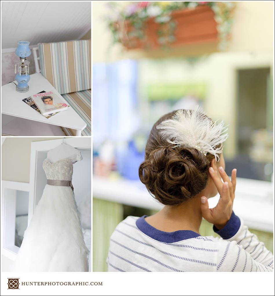
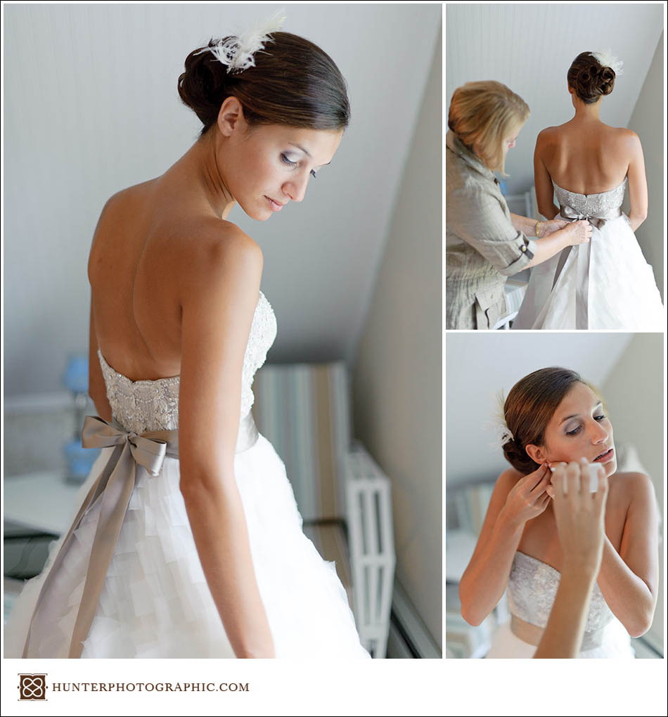
Katie’s dress was one of the best I’ve seen all year (or all time really). It matched her figure and wedding design perfectly. I personally loved the two-tone style and the detailed embroidery.

Katie and Mischa's victorian-inspired wedding in Chautauqua, New York

Katie and Mischa's victorian-inspired wedding in Chautauqua, New York
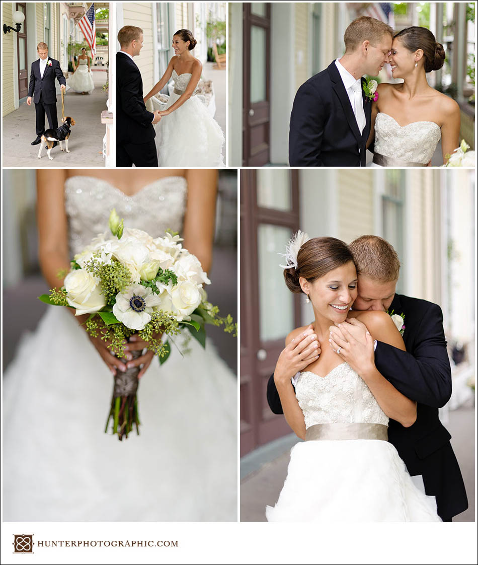
First look photos are always my favorite, and they are even better with the family dog. Did I mention we love dogs! We used the porch of the Athenaeum Hotel due to a little rain passing through the area.

Katie and Mischa's victorian-inspired wedding in Chautauqua, New York

Katie and Mischa's victorian-inspired wedding in Chautauqua, New York
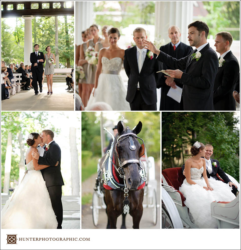
Even the horse came dressed for the occasion. Metal hearts and lucky horseshoes covered the carriage and tack.

Katie and Mischa's victorian-inspired wedding in Chautauqua, New York
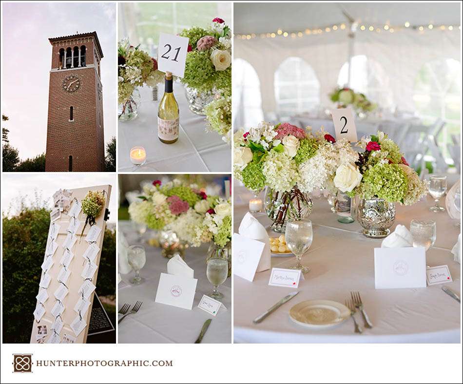
Following the ceremony, the wedding party simply to the reception – held at the Bell Tower in a gorgeous tent. The flowers and little details were amazing. I hear the food and drinks were even better.

Katie and Mischa's victorian-inspired wedding in Chautauqua, New York
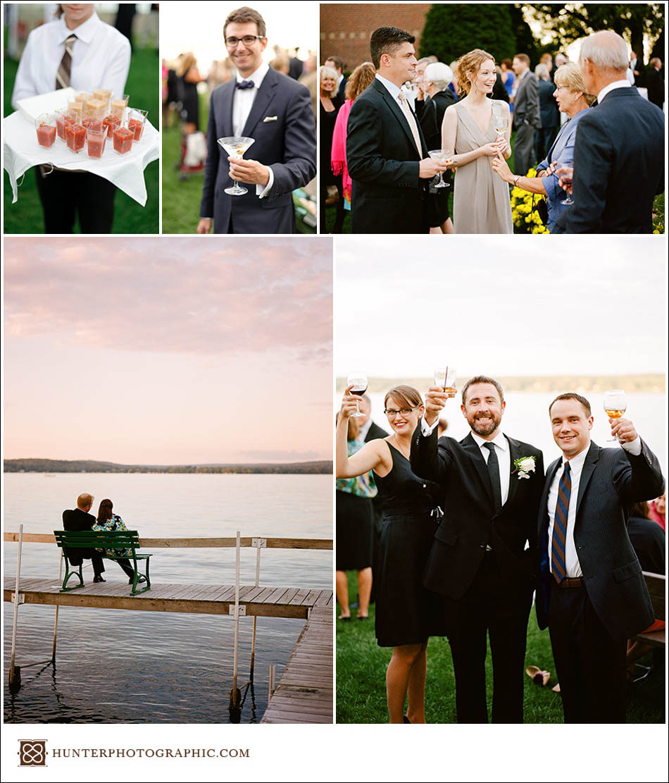
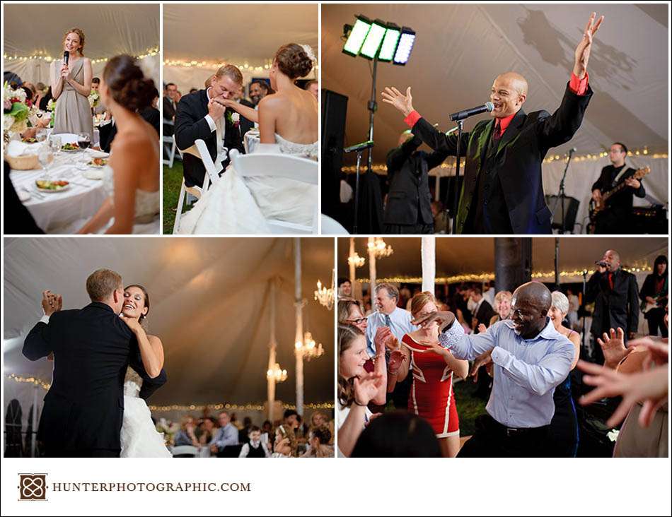
After a sunset cocktail hour on the edge of Lake Chautauqua, it was time for toasts, dinner and dancing. The band played late into the night as nearly everyone was on the dance floor. I think even the grandparents got into the energy.

Katie and Mischa's victorian-inspired wedding in Chautauqua, New York
Katie and Mischa’s wedding ended up being one of my most enjoyable this year. The weather was a little worrying, but it held off until my late-night drive home. If you’re still considering your wedding plans, think about how to make the wedding personal. Buck the “industry” trends and do something important to you. In the end, considering a personalized wedding will make for a better, more loving experience.

P.S. – In hindsight, I should have stayed in Chautauqua through Sunday. It would have given me a chance to produce some nice personal work. The scenery is just so beautiful.

!-- Google tag (gtag.js) -->