Category: For Photographers

A Bird, Boat, Bike, and Bridge

I often find myself location scouting for weddings on odd days here and there. Add to this that I am easily distracted (look, something shiny!), and I typically come home with a grab bag of images. Lately, that grab bag has been filled with scenery shots, because well, I must practice my scenery and details shooting. Portraits come much easier for me.

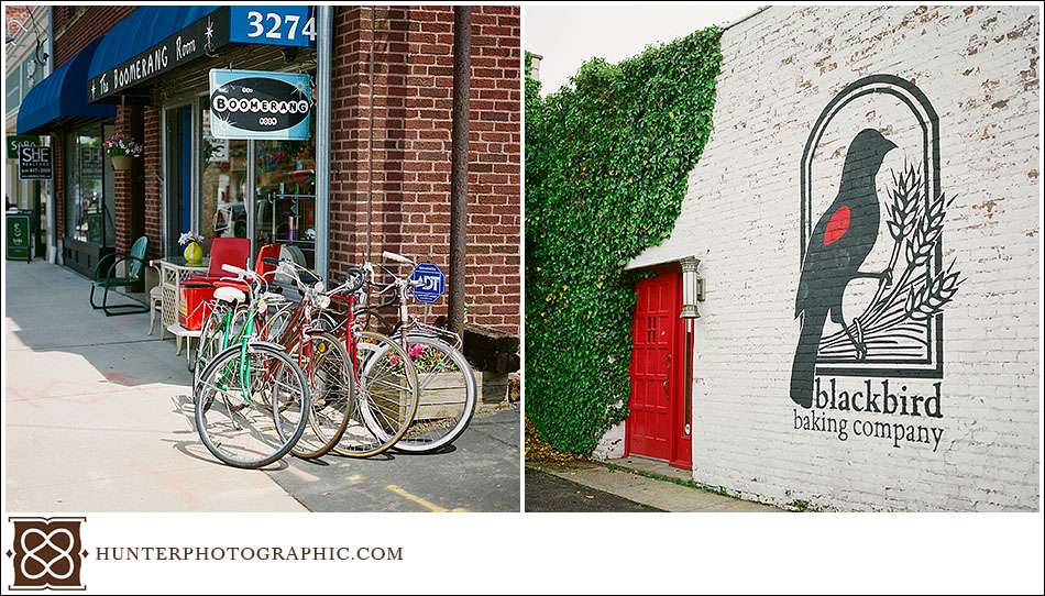
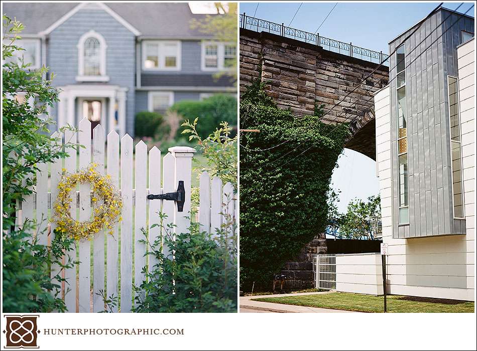
So, below are a collection of recent scenery shots from around Cleveland and Lakewood. Some of you may even recognize the locations. When I saw the alliteration between the images, I knew I had to post them.


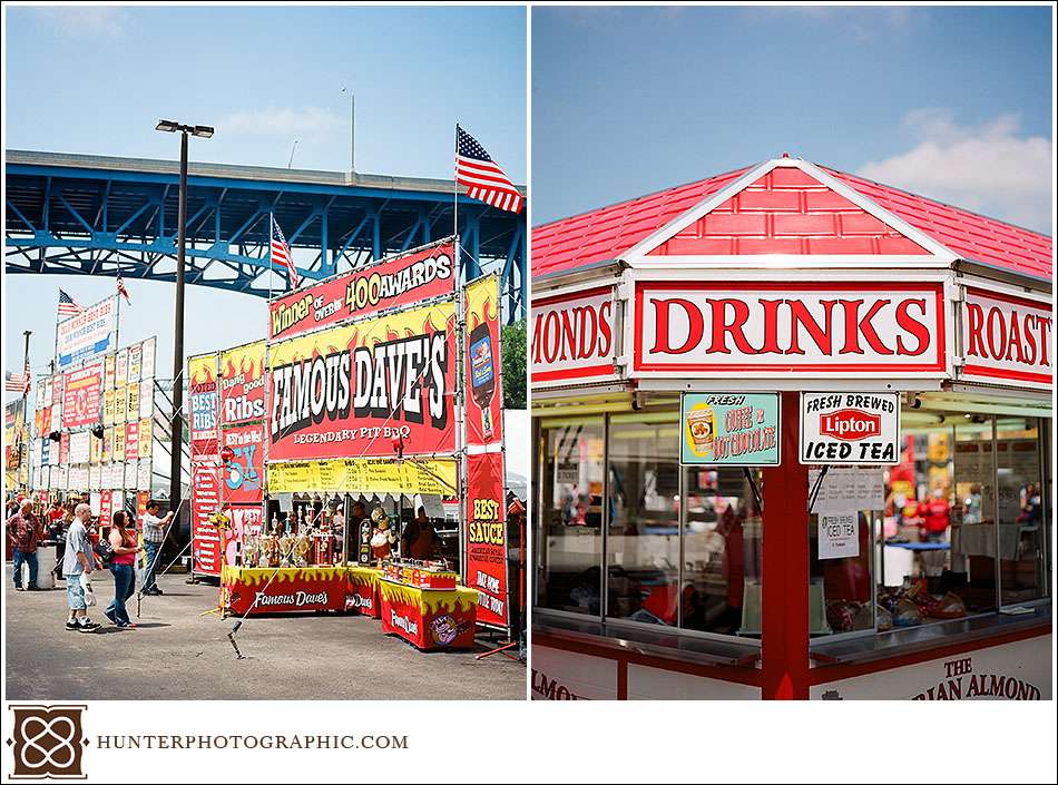
Above is the Cleveland Jazz and Rib fest held each Memorial Day weekend.

I have always wanted to photograph Blackbird’s red door against the green summer ivy.

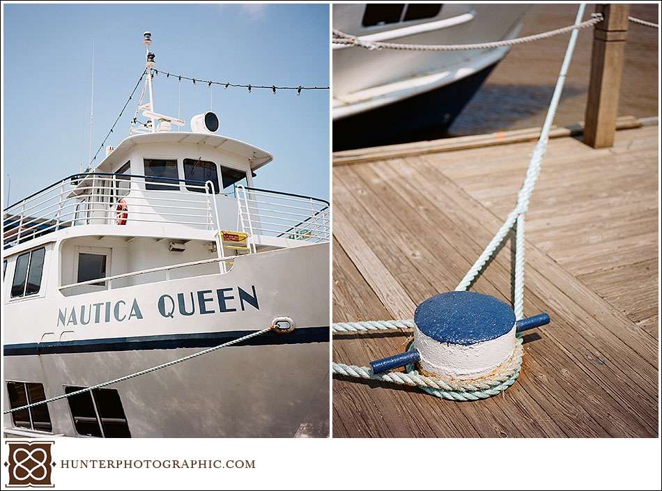
Most of you will probably recognize the Nautica Queen parked on the Cuyahoga River is downtown Cleveland. I just love how the film was able to handle the bright white while also opening the shadows. It really does amaze me sometimes. So, that’s a bird, a boat, a bike and a bridge. For those that get into the techie stuff, all of the above is Kodak Extra shot on a mix of Mamiya and Hasselblad.

Crafting Heirlooms

My modest Cleveland home is filled with fine-art prints of all sorts. There are family photos, photos of friends, some clients and even some crazy prints. For example, a large print of two friends dressed for a wedding as Dumb and Dumber. Seriously, a wedding! We also have a few albums, all of which we treasure. When developing our recent branding redesign, we also reconsidered the fine-art prints and albums we offer. To match with the our clients expectations and the brand, we had to make improvements.

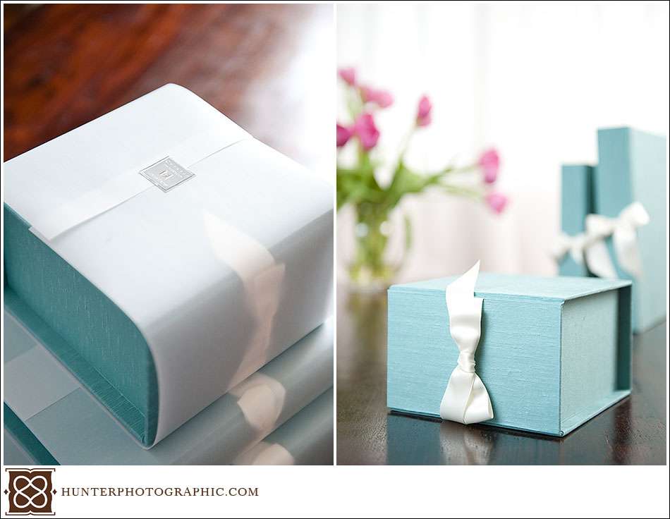
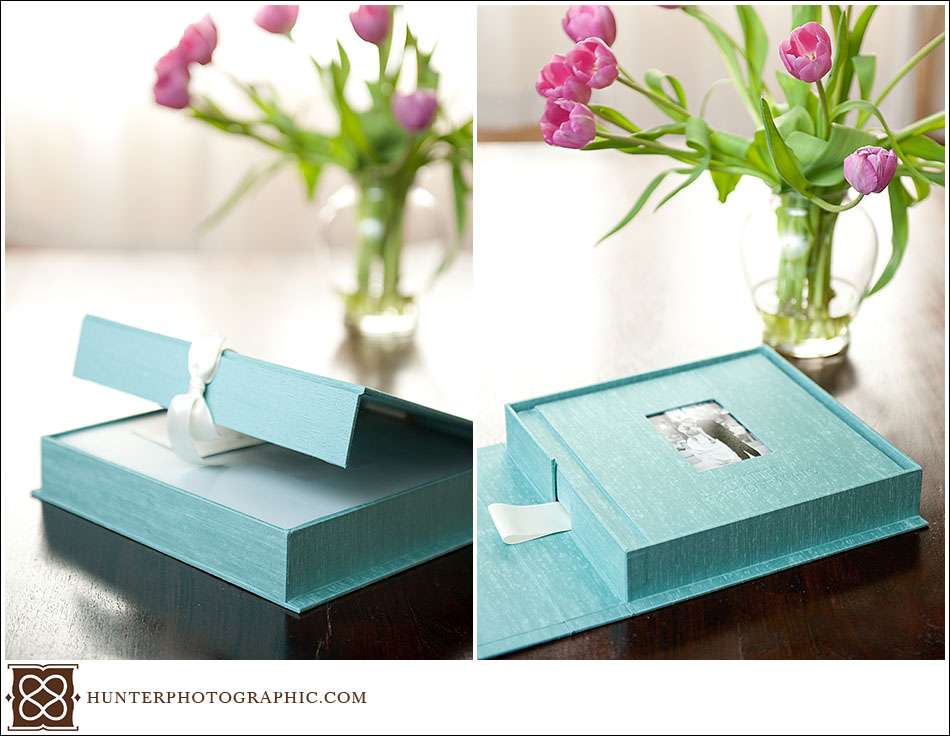
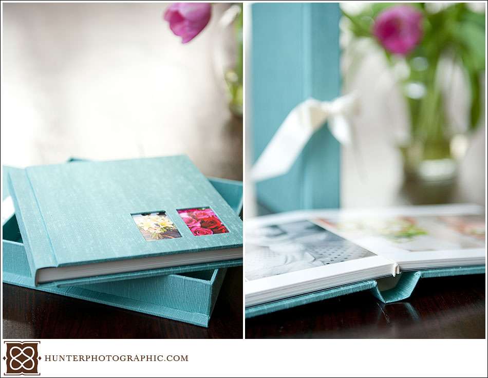
As we always have, we continue to provide our clients with the very best prints. All wedding prints are printed on true archival-quality photo paper by the best lab available. But as part of the branding redesign, I wanted to make delivery of client proofs into a “gift.” So, we teamed with the best wedding album producer available to create something really special for all of our clients. Cypress Albums helped us to create the Proof Presentation Box.

Like any other print, we give our clients fine-art proofs. The individual proofs are now paired with a archival-quality box for storage and display. Each box is bound in Japanese book-binding silk, features a magnetic closure, and decorative ribbon. So far, the response has been overwhelming. More so, I want to keep each box that arrives, but I am happy to give them to our wonderful clients! Should a client choose, each box can be customized to match their style  in one of many different fabrics.

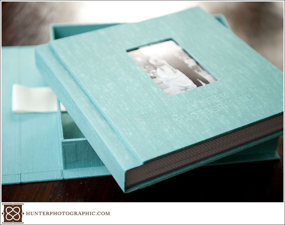
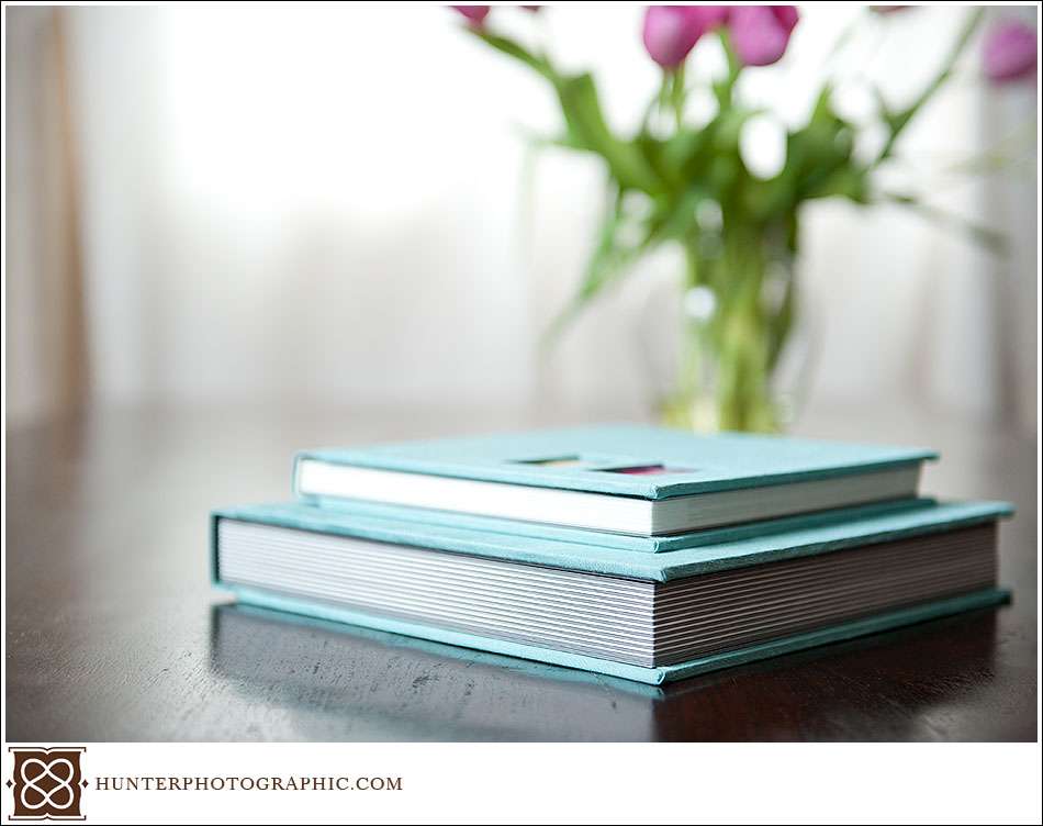
Our albums have received a similar upgrade. Working again with Cypress, we created the Heirloom and Whistler albums.

Heirloom Album

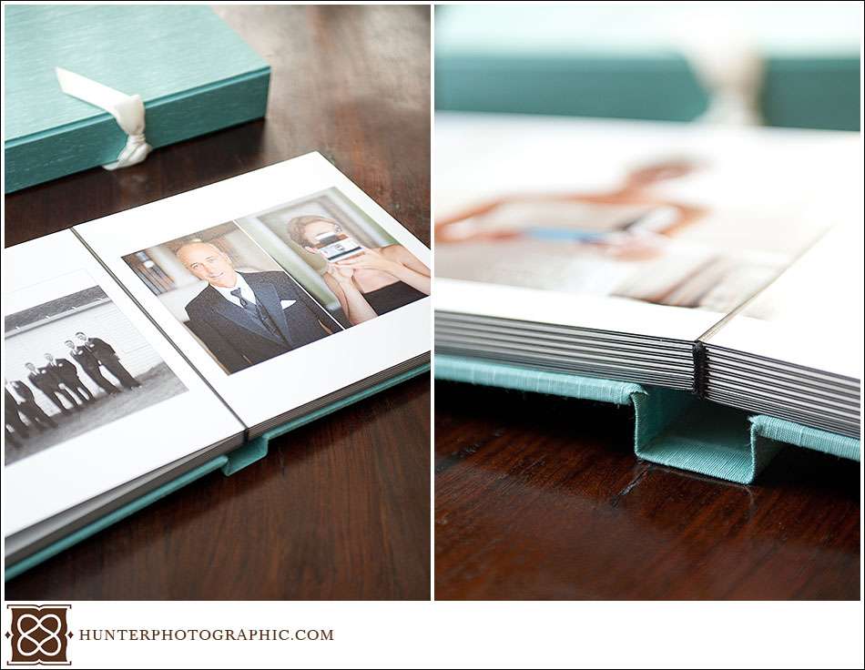
True heirlooms are build to last for generations. The desire to feature such high quality albums is born from my own experience. I still have prints from my great-grandparent’s wedding. I love the vintage feel and quality of the prints. Each Heirloom albums is custom designed for our clients. After carefully selecting the images, design the layout and choosing fabrics, the albums are then hand-made by Cypress. Each fine-art print is adhered to a very heavy page and bound tightly into the album. Many clients also choose to keep the album safe in a presentation box.

Whistler Album

The approach to the Whistler album matches the Heirloom album – the best build and quality available. The image selection, layout design and fabric selection all follow an identical process. However, there is one key difference between the Heirloom and Whistler albums. Where the Heirloom album pages are like boards, the Whistler has thinner, lighter page cores. Each page is still very thick, but the weight of the book is reduced. Due to the lighter weight, the Whistler sits nice in the hand.

Many of our friends and clients choose the Heirloom album for themselves and order a matching Whistler album for their parents.

Of course I just love showing off our samples. They are filled with create memories from friends and clients. I keep them in our living room as a nice reminder of all the great couples I have met. I am certainly looking forward to crafting many more heirlooms for future couples.

P.S. – Completely unrelated, but I wonder if our dog understands trips in the car. Does she know she’s moving, or does she think the scenery is just changing really fast?

Photographer Branding and Mark Twain

I came across the following quote the other day and think it’s fitting for this post – “If you do what you always did, you will get what you always got.” I have no clue who coined the quote , but it feels Twainish (or is that Twainian?). Or would that be Twain-like? At any rate, back to the topic which I have not even introduced – branding.

The above quote applies because I was doing things the same old way. When I started, I designed my own business card and found a cheap printer. $19.99 for 1000 business cards is a good deal right? I also created a contract and some brochures in Microsoft Word and print those myself. It all looked kinda professional. Looking professional worked a little, but there was a problem.

I am not a designer…despite my wild imagination! Furthermore, I jumped head-long into creating a “brand” before I considered who I am or who I wanted for clients. The lack of a considered approach really showed. It was time for a fresh start.

The first step was the hardest, but the most crucial as well. I had to consider who I was and who I wanted for clients. A photographer’s brand must speak eloquently to both purposes. Defining this core message was really just a thought exercise, but a tough one. Each idea had to be carefully considered and weighed. Through the process, I asked myself questions such as –

  • Imagine your new brand – what feelings, objects, ideas or people would you associate with the brand?
  • Think of yourself – what 3 words describe your work the best?
  • What are the characteristics of people with whom you want to work?

Only after the above concepts were defined (and a million others) did I feel comfortable moving to the next step. I’m smart enough to know I needed professional help (in more ways than one). Maria Pastore joined the project as a professional designer and business branding ninja. She brought a creative eye for print, which was important. She also brought a great ear for messaging. With a well developed message in hand, Maria and I set out to create some key branding materials including a new company name, business cards, website design and client package. Collectively we realized that the following ideas were critical to the overall message and brand –

  • The services and brand should feel like a gift
  • The design had to be approachable, modern and with hints of classic elegance
  • The color palette should be warm and inviting
  • Feel was important, so papers should be tactile and rich
  • Handmade quality, as with all my work, is paramount

Next was sourcing materials and choosing printing providers. Do you know how many types of paper there are? It’s gotta be about a gazillion! I won’t bore you with the details, but let’s say the results are amazing. The letterpress business cards are to die for. When handed over, every clients gently feels and studies the card. That is how I know we accomplished our goal.

A well-defined and meaningful brand works. The clients who choose my work are exactly the people I want to work with. They are some of the most extraordinary people and I am forever grateful for them. I am also forever thankful for Maria….even when she tells me “bad idea, Home Boy!” (I made that last bit up). The above information should not make branding sound easy. I could have written volumes on the subject, but chose to keep it short.

Below you can see just a small preview of the outcome. With this level of quality, my brand will be my heirloom.
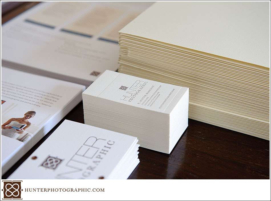
Branding materials for Hunter Photographic, a Cleveland wedding photographer

Above, letterpress business cards nestled among the building blocks for the client package. Below, hand-stamped cover tags for each package (they take forever to make).
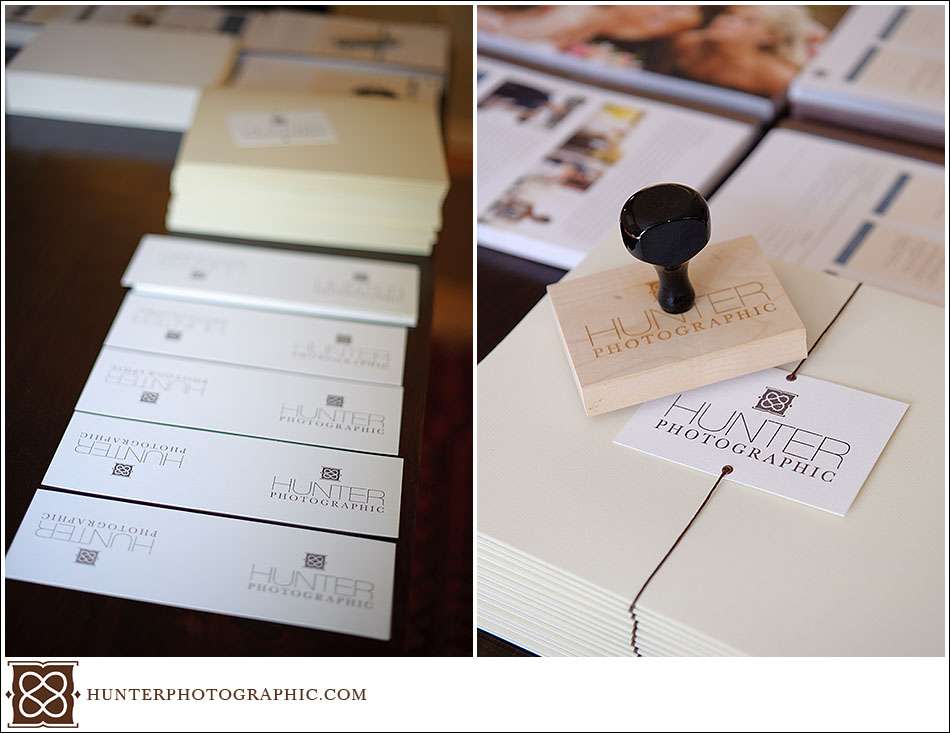
Branding materials for Hunter Photographic, a Cleveland wedding photographer

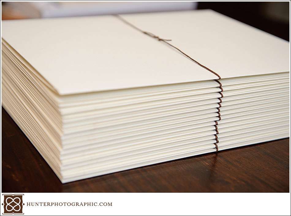
Below is the finished client package, folded tightly and sealed with a love knot.
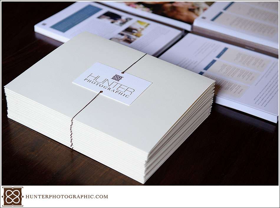
Branding materials for Hunter Photographic, a Cleveland wedding photographer

The front cover of the client package. In the background are the assorted contents ready for stuffing in the dutch felt folders.
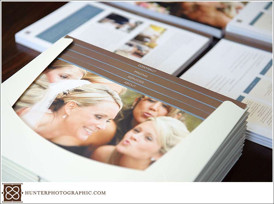
Branding materials for Hunter Photographic, a Cleveland wedding photographer

What clients see when they first open the gift, err package.
Branding materials for Hunter Photographic, a Cleveland wedding photographer
Soon I will have some more information about my brand development experience. I also have a piece coming about our new Heirloom and Whistler wedding albums. They are truly amazing and the best quality imaginable. Make sure to stop back. In the mean time, stop by Facebook or Twitter to say hello.
!-- Google tag (gtag.js) -->